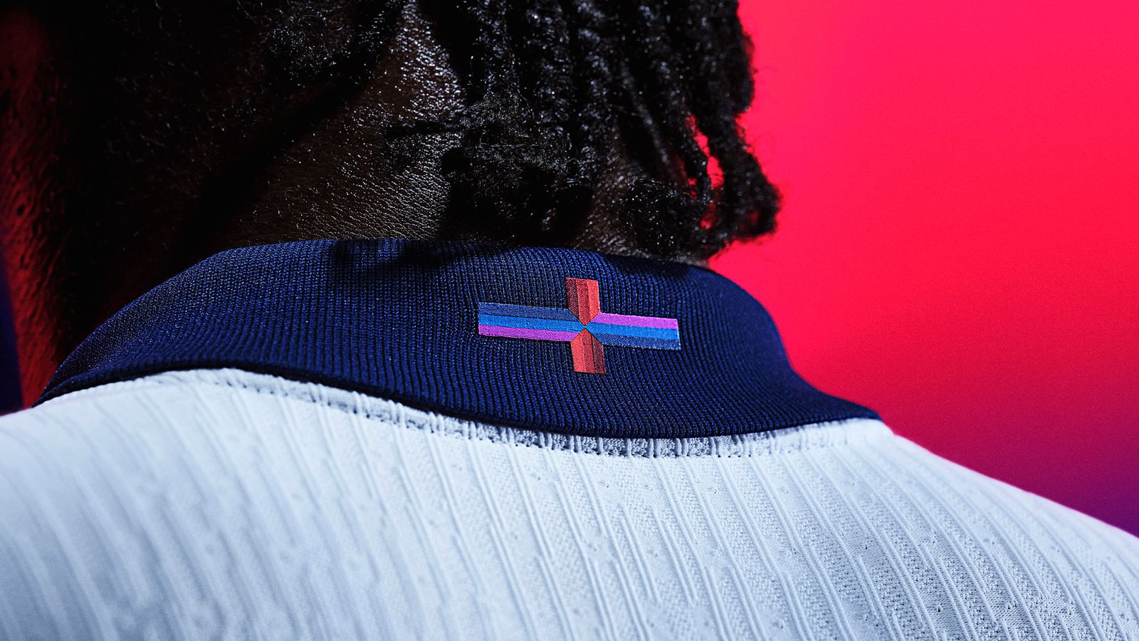
Nike’s “playful” redesign of the St George’s Cross on the new England kit has sparked a row – but it’s not the first time a logo change has caused a furore.
The row intensified on Friday when Conservative Prime Minister Rishi Sunak also warned against “messing with” the national flag.
It comes after Labour leader Sir Keir Starmer backed criticism of the American sports brand over the new motif featuring a purple, blue, black and red cross on the back of the England shirt.
Meanwhile, Labour shadow attorney general, speaking to Sky News, added: “You wouldn’t expect Nike to look at the Welsh flag and change the dragon to a pussycat”.
Nike’s redesign is not the first to spark controversy, particularly in the world of sport. Here are some of the most famous rows involving logos, kits and badges.
Leeds United
Sitting atop the badge of Leeds United is the white Yorkshire rose – a symbol of a historic county known for its pride.
So when the club’s then-Italian owner decided in 2018 that it was time for a complete overhaul of the Leeds United badge, it was always going to come with a degree of risk.
Out went the Yorkshire rose and the blue and yellow crest design used since 1998, and in came a man with his arm across his chest in a motion known as a “Leeds Salute”.
Despite claims that the new badge had been selected in consultation with 10,000 people associated with the club, it sparked an immediate pushback, with a petition against the crest receiving more than 50,000 signatures in a day.
The ownership went back to fans and, after another consultation, plans to introduce the new “Leeds Salute” badge were dropped and the club’s old badge was restored.
Cardiff City
Across the English football league, more than half of all clubs play in either red or blue as their main colour and in a game of history and tribalism, swapping between them is practically unheard of.
But that’s exactly what Cardiff City owner Vincent Tan did in 2012 when he replaced the club’s iconic bluebird emblem with a Welsh dragon.
The Malaysian businessman also changed the kit colour from blue to red – the first time The Bluebirds had not played in their primary colour for over 100 years.
The idea at the time was to appeal to more “international markets” and “demonstrate the symbolic fusion of Welsh and Asian cultures through the use of the colour red and the predominant featuring of a historical Welsh dragon”.
But the move sparked fury from fans. Initially, Mr Tan refused to back down, saying there was “no way” the kit would revert to blue under his ownership.
However, amid continued pressure from the fans, he did eventually relent and agreed to bring back the club’s traditional colours and logo in 2015.
Spain
England is not the only national team to have a kit controversy.
In 2017, German sportswear brand Adidas faced fury after critics claimed the colours of Spain’s national team’s shirt were too similar to the flag of Spain’s Second Republic – instead of its current national flag.
Spain’s Second Republic spanned eight years from 1931 to 1939 and officially ended following the victory of nationalist leader Francisco Franco at the end of the devastating Spanish Civil War.
The republic’s flag featured a purple strip at the bottom of Spain’s red and yellow bands – and critics of the national team shirt drew comparisons due to the inclusion of a splash of purple down the shirt.
Adidas flatly denied the shirt design was political, and instead said it was an homage to Spain’s 1994 World Cup shirt.
To add to their woes, while wearing the kit, Spain were knocked out of the 2018 World Cup at the round of 16, losing on penalties to hosts Russia.
London 2012
Less of a redesign, but the logo for London’s 2012 Olympics caused both amusement and controversy.
For a start, the £400,000 logo, designed by consultancy agency Wolff Olins, proved unpopular in polls at the time of its unveiling.
With its jagged edges, it drew mocking comparisons to the character Lisa Simpson, while an epilepsy charity raised concern after reports people had suffered seizures while watching a piece of animation as part of the logo’s launch event.
Read more from Sky News:
Maguire says he did not give Tories permission to use picture of him
‘Truly eye-watering’: UK’s highest amount of student debt revealed
But it later became the centre of another row after Iran claimed the 2012 logo depicted the word “Zion”, a name used in the Hebrew Bible to depict the Land of Israel – and to which Iran contests the country of Israel’s claim.
Iran threatened to boycott the 2012 Olympics over the row – though they did compete in the end.
British Airways
Away from sport, British Airways famously provoked the ire of former Prime Minister Margaret Thatcher with a redesign of its tail wings in 1997.
The company’s planes traditionally featured a red, white, and blue tail wing.
Be the first to get Breaking News
Install the Sky News app for free
But in 1997 they brought in international artists to produce a series of designs which they hoped would move the company away from its traditional British theme to make the airline appear more “global and caring”.
The move cost British Airways an estimated £60m at the time and was praised by some as “brave”.
However, one person who did not approve was Mrs Thatcher, who made her feelings clear by covering the tail wing of a model plane with a piece of tissue.
“We fly the British flag, not these awful things,” she said at the time.


